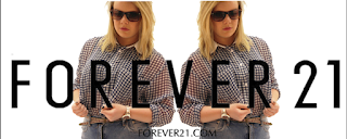
For my recreation of the billboard, we started off with trying to find the right facial expression that was alike to the original model; sassy and somewhat confident. It took time and a lot of consideration to find the right facial expression and once we did we had to consider para linguistic features. Although the camera angle/shot is eye level and a medium close up, we still had to get the right body language that suited the model. Thus making us think about posture.
We tried to get similar props such as the sun glasses as this is what makes the image have an indirect mode which makes it somewhat enclosed and personal. It also makes me think that maybe this type of high end clothes aren't suitable for everyone and the indirect mode cuts off a certain audience group but engages the specific target audience.
We tried to get similar props such as the sun glasses as this is what makes the image have an indirect mode which makes it somewhat enclosed and personal. It also makes me think that maybe this type of high end clothes aren't suitable for everyone and the indirect mode cuts off a certain audience group but engages the specific target audience.
When creating my own billboard, I will use direct mode of address as I want my magazine to engage all types of audiences and for there not to be a cut off point. I also have to think about posture and facial expressions, the one on my recreation are quite harsh and they aren't inviting to a younger audience. This won't work well with my regional magazine as I'm trying to engage an audience from the age of 14 and over. The harsh facial expressions will only relate to the older generation. Therefore, I need to consider more softer and inviting paralinguistic features for my own billboard that will relate to all of my audience.


